Posted by
virtualinfocom
8:05 AM
![]()
![]()
Category:
With watercolors, it’s not always easy to achieve pure, intense colors and a full range of values. Worse yet, when you scan a watercolor painting for reproduction, you’re likely to lose even more of the color and contrast.
The best way to avoid these technical problems is to adjust your painting style to achieve the strongest colors and values from your watercolor paints possible.
Here are seven different ways that watercolorists can create darker values and stronger colors to enhance their paintings:
1. Use artist-grade watercolors.
Even if you stay away from toxic hues like Cadmiums or Cobalt, artist-grade watercolors have more color and less binder, which means extra pigment on the paper and more concentrated intensity.
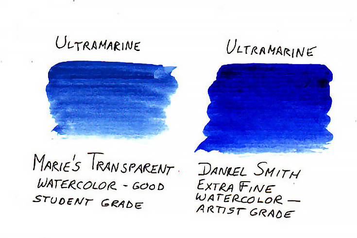
One of the reasons that artist-grade watercolors have more intense pigments is because the pigment particles may be milled finer, so that more of them fit in around each other in the same drop of gum arabic.
In pan watercolors, how the pigments are treated while the pans are being made can also affect their strength. Yarka St. Petersburg Professional watercolor pans are poured and dried rather than extruded, which protects the delicate pigments and results in colors that dry with nearly the same intensity as they look when wet.
2. Make test swatches and let them dry.
Watercolor has a unique problem of drying about 50% lighter than it looks when it’s wet, especially on watercolor paper. So it may help to simply mix a wash that’s twice as dark as you want, then test it on a scrap of watercolor paper first.
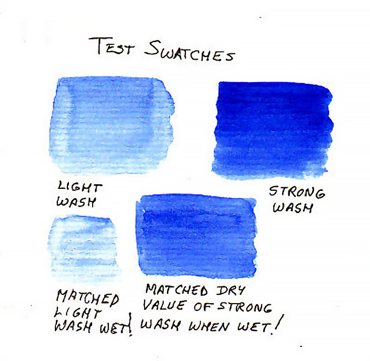
Let the test swatch dry thoroughly and adjust the wash up or down by adding more water or more paint till you get it to the value you want.
3. Let your painting dry, then glaze it.
If the painting’s already done and looks too light, you may be able to go over it again with a glaze to make it darker.
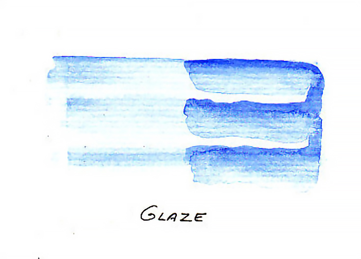
First, let it dry thoroughly—your painting must be bone-dry for a glaze to work. In a moist climate that would be letting it dry overnight. Mix the same colors again, or mix them slightly darker, then gently go over the light areas again with a glaze.
Paint area by area until the entire painting is one or two steps darker. Keep hard edges intact by letting them dry completely before adding any adjacent glazes.
Watercolor will go over other watercolor without mixing or reactivating if you work fast (don’t linger over one spot, or scrub into the dry paint below) and of course, always make sure that it’s completely dry to begin with.
4. Use paint right from the tube.
For bold areas of intense color, don’t bother diluting the watercolor! Squeeze out a bit of Cadmium Yellow or Payne’s Grey and dip the brush right into the creamy, gooey paint. Smooth out your strokes if you like, but paint directly in tube color without dilution to get the purest colors and strongest darks.
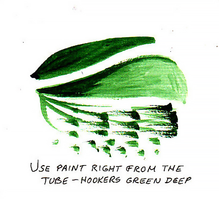
This is also a great technique for getting good dry-brush effects as the tube paint is thicker than any washes. Test it on scraps to discover how much you need to put on the brush to get either full coverage, or a good dry-brush effect.
5. Undersketch with watercolor pencils.
Watercolor pencils are made up of concentrated color, so any sketch lines or patches done with good artist grade watercolor pencil can be covered heavily and rinsed to create a strong color.
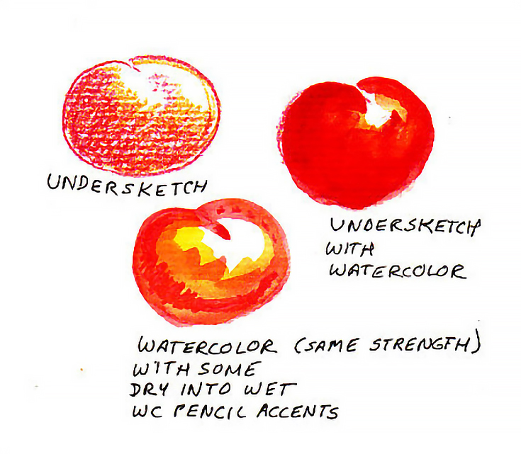
Use more pressure and multiple layers of color for dark tones before washing. Watercolor pencils are especially good for creating small, dark, colorful accents. Draw them in, then wash with a pointed round brush.
If you draw directly onto the paper while the paper is damp, an even more intense color may result.
6. Use pen accents.
Hatching and stippling can also give a beautiful textural effect to a watercolor painting that’s come out too light, since you’ll be reinforcing the lighter value areas without changing their hue. This is an excellent way to add details at the end of a painting.
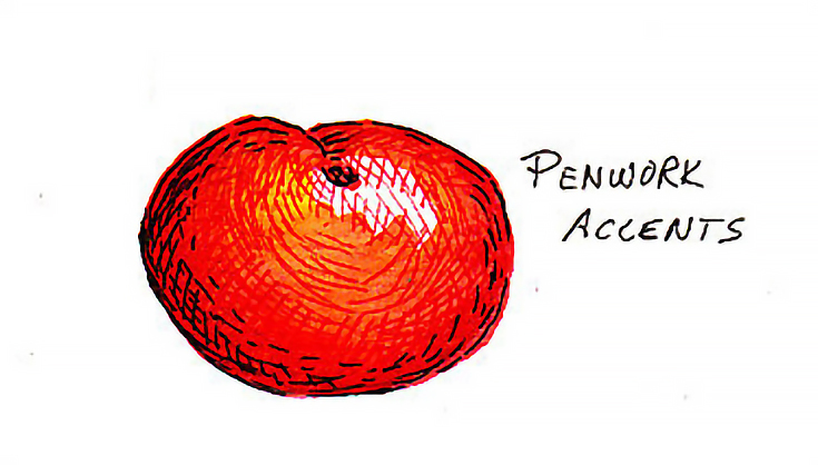
Using watercolor with pen and ink produces a gorgeous traditional style, reminiscent of Audubon and numerous other classical watercolorists. India ink used with a brush can fill in flat black areas for maximum intensity, while colored inks can sometimes have a stronger intensity than watercolors.
Penwork is a great fix for many problems in failed watercolors. Consider looking over some of your old faded paintings to see if they can be spruced up with a technical pen, dip pen or the new breed of archival extra-fine point pens like Sakura Pigma Micron, Pitt Artist Pens or Prismacolor Archival Markers.
7. Work out your value range ahead of time.
Do a monochrome version of the painting first, even if it’s small. Create a few notan or charcoal sketches of the subject, then try it with an ink wash or watercolor wash in monochrome blue, brown or black.
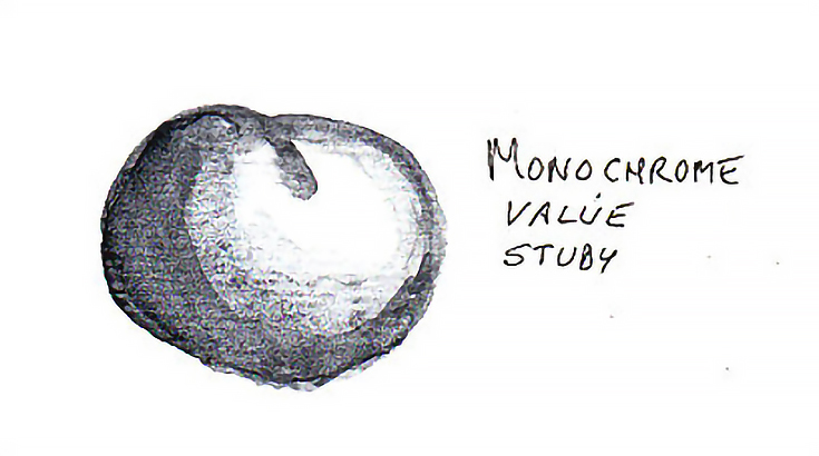
Coming up with a notan will help you plan your areas of light and dark, as well as build a good composition from the very beginning.


Comments (0)
Post a Comment